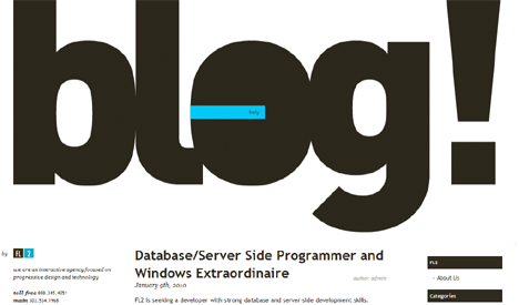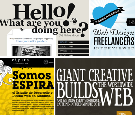
“Web design is 95% typography.” That quote has been repeated around the internet so many times it has practically become gospel – probably because it’s true. While images are important,
most of what we process while browsing the web is text. Using the same old boring fonts doesn’t make for exciting design, so some graphic artists have turned typography on the web into a stunning art form unto itself. These 18 websites use typography to inform, but also as an (often interactive) design element that’s like a magnet for our eyeballs.Espira Web Technology
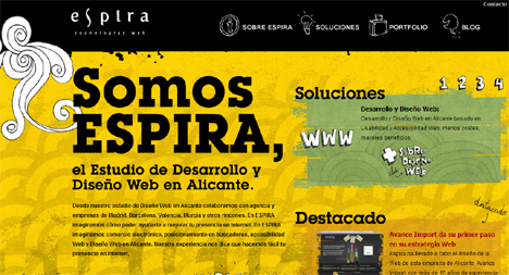
Priorities, priorities, priorities. Espira Web Technology has emphasized the most important words on the page using large, eye-catching typography that’s a seamless part of the overall design of the site. Following the cardinal rule of using serif typefaces only for headings, the text is easy to read and almost forcibly pulls you in regardless of whether you even speak Spanish.
Jesus Rodriguez Velasco
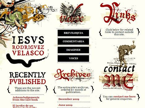
Sometimes, typography is used in web design to firmly establish the theme or essence of what the site is all about. In this case, archaic-looking typeface and hand-painted symbols hint at what’s inside: “a veritable panoply of literary, visual and aural diversions related (or not) to academic pursuits, arcane (or simply dusty) vagaries and very earnest but most likely misguided contemporary concerns.” The author, Jesus Rodriquez Velasco, is a medieval and early modern studies professor at Columbia University.
Oliver Kavanaugh Design
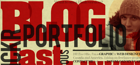
It’s big. It’s loud. It’s overwhelmingly the most important element on the page, and that’s the point. Graphic and web designer Oliver Kavanaugh managed to make jumbled, overlapping text that might be far too busy in the wrong hands work with subtle texture, a controlled color scheme and careful attention to composition.
Ryan Keiser Design

“I create usable accessible colorful experiences.” All three of those adjectives also apply to the typography-centered design of this website, helping Ryan Keiser establish his brand in a way that’s immediate and memorable.
Denise Chandler Design
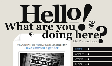
Can you resist scrolling further down the page after getting a look at this web header? It’s clean and simple yet dynamic – even without the cute animated insects. Web and graphic designer Denise Chandlershowcases her talent with an online portfolio that’s classic and modern all at once.
The New York Moon
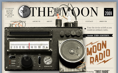
Sure, the most eye-catching element of this page is that huge vintage radio. But though it may be subtle, the typography on The New York Moon website still shines. It’s a great example of how less can be more – the type doesn’t have to be acid-bright or two inches tall to call attention to itself and help define the page.
Kidd 81 Design
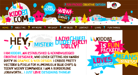
It’s not hard to tell that Paul Jamie Kidd really loves his job. Everything about the playful, colorful typography on his website screams “fun” – but not in an annoying way, thanks to the balanced white space and neutral brown background.
Circus Family Design, Direction, Animation & Production
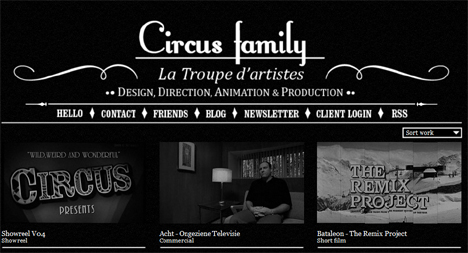
Whoa – four different typefaces in a row? That’s usually a terrible idea (especially on the web) – but Circus Family pulls it off here with an austere layout and monochromatic color scheme. The chosen typefaces give the site a very “edgy silent film” feel – appropriate given the nature of the company’s work.
Alpha Multimedia
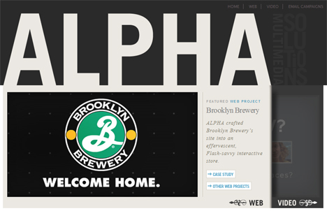
How can a brand name force itself into your head without screaming like a headache-inducing car dealership commercial? Alpha Multimediagets it done with excellent use of negative space, filling in the entire header with the word and subsequently drawing your eye down the page to view their featured work samples.
Lorem Ipsum Design
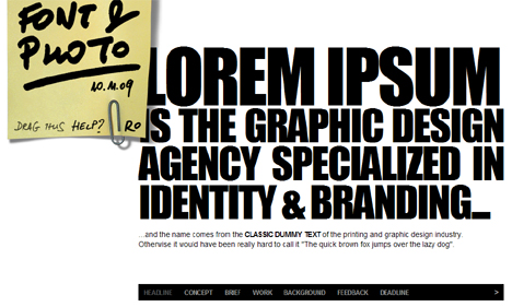
There’s an argument to be made that using ‘lorem ipsum’ isn’t a great idea when designing a website, but that doesn’t extend to using the graphic design agency of the same name. Lorem Ipsum Design goes bold and, well, graphic with a home page featuring nothing but two fonts, one a stark sans serif and the other a hand-written scrawl on a moveable post-it.
Maurivan Luiz Design
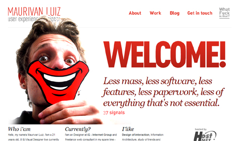
The word ‘WELCOME!’ in huge typeface with an exclamation point at the top of a website can be a sign of an amateur designer. That’s definitely not the case here. Maurivan Luiz keeps the friendliness from being cliché – the greeting warmly sets the tone for the site and balances well with the white background and the italicized serif text below it.
The Astonishing Adventures of Lord Likely
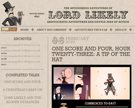
What would the blog of a hedonistic Victorian gentleman with a penchant for getting sidetracked by the ladies while solving mystifying mysteries look like? A little something like LordLikely.com, a rather racy account of all sorts of mustachioed aristocratic adventures. The chosen typefaces and parchment-like background are evocative of the era, but the clean design is a nod to the modern world.
Love Freelancing
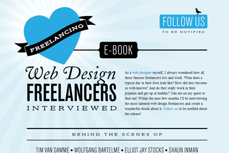
Sometimes, the right balance of typography is like music – it flows with its own rhythm and harmony. Web designer Kai Branch created this little site to hype an ebook of web designer interviews, and it does the subject proud with a beautiful composition of type in various fonts, sizes and orientations.
Giant Creative Web Design & Development
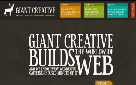
Who needs fancy illustrations when you’re this good with nothing but type? A web design and development firm called Giant Creative literally makes typography the center of attention on their own website. The design is clean yet fun, using a font that’s just playful enough to give a lighthearted yet professional impression.
Ben Lind Design
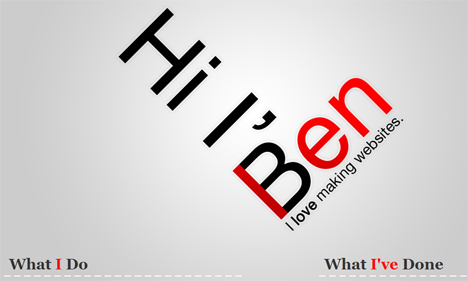
“I create simple, clean websites that are easy to use and fun to look at.” So says designer Ben Lind on his own website, but perhaps he needn’t have. The design of his site says it all, with a large typography graphic in the center that not only reads “Hi, I’m Ben, I love making websites” but also forms an L for his last name.
Elysium Burns Design
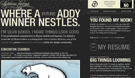
Graphic designer Sean Baker goes for bold sans-serif type for headlines and titles and a more elegant serif font for the text blocks, but with a tightly controlled color scheme and varying font sizes, it all comes together into a cohesive design.
FL2 Blog
